)
In retail, every detail matters—from the layout of your store to the music playing in the background. Yet, one of the most potent tools at your disposal is often overlooked: colour. The hues you choose for your merchandising and display strategy can profoundly influence customer behaviour, emotions and purchasing decisions. By understanding and strategically applying colour psychology, you can create an environment that not only attracts customers but also enhances their shopping experience.
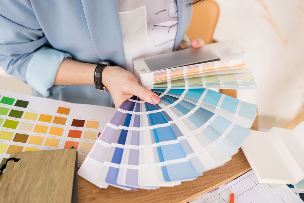
Understanding Colour Psychology in Retail
Colour psychology delves into how different colours affect human behaviour and emotions. In a retail setting, the colours you incorporate can set the mood, convey your brand's personality, and even drive sales. Between 62% and 90% of consumers say they form a subconscious judgment about a retail environment based on its colour within just 90 seconds of their first impression.
The Emotional Impact of Colours
Colour plays a fundamental role in shaping a customer's perception and behaviour within a retail space. Beyond aesthetics, each hue carries its own psychological weight, subtly influencing mood, decision-making, and even dwell time. Here's a closer look at the emotional and psychological responses typically associated with some of the most commonly used colours in retail design:
Red
A bold and dynamic colour, red is often linked with energy, passion, and urgency. It naturally draws the eye, which is why it's a staple in clearance signage and promotional displays. Red also has a physiological effect—it can raise heart rate and stimulate appetite, making it a go-to for food retailers and fast-food chains. In the context of visual merchandising, red is best used strategically to highlight impulse purchases or time-limited offers, creating a sense of excitement and encouraging quick decisions.
Blue
Blue is synonymous with trust, dependability, and serenity. It tends to evoke a calm and composed atmosphere, which can make customers feel at ease while browsing. This emotional reliability is one reason why blue is so prevalent in technology stores and financial service environments—it communicates stability and professionalism. In retail design, softer shades of blue can enhance a tranquil shopping experience, while deeper tones convey authority and sophistication.
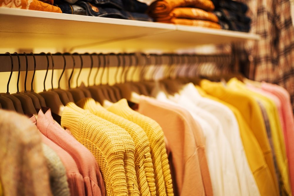
Yellow
Bright and inviting, yellow is the colour of joy, optimism, and youthful energy. It's highly effective at grabbing attention and creating a welcoming ambience. Used in window displays or signage, yellow can pique curiosity and draw customers in. However, it's a colour that demands moderation—when overused, it can become overwhelming or even cause visual fatigue. As such, it works best as an accent or highlight to inject positivity without overpowering the space.
Green
Often associated with nature, health, and renewal, green conveys a message of balance and wellbeing. It's particularly powerful in spaces that promote sustainability, wellness, or organic living. From a psychological standpoint, green has a calming effect, which can encourage shoppers to linger longer. In retail interiors, incorporating greenery or green tones helps to soften the overall environment, aligning especially well with brands that prioritise eco-conscious values or natural ingredients.
Orange
A vibrant and enthusiastic colour, orange blends the urgency of red with the warmth of yellow. It's energetic and friendly, making it ideal for attracting younger demographics or promoting action—think call-to-action buttons, sale tags, or interactive product zones. In visual merchandising, orange is great for emphasising playful, affordable, or fast-moving merchandise. It's a colour that radiates approachability and movement, often seen in sportswear stores or trend-driven fashion outlets.
Purple
Purple has long been associated with royalty, creativity, and spiritual depth. In retail, it's used to convey a sense of luxury, exclusivity, and indulgence. Lighter lavenders bring a sense of calm and femininity, while rich, darker purples add a dramatic and premium feel. This makes purple a popular choice in beauty, cosmetics, and high-end fashion displays. It invites shoppers to explore and experience the more refined, aspirational side of a brand.
Black
Timeless and elegant, black suggests sophistication, authority, and modernity. It's a mainstay in high-end retail, where it contributes to a sleek and refined atmosphere. When used effectively, black can make other colours pop, providing striking contrast and visual drama. In visual merchandising, black serves as a neutral yet powerful backdrop, often paired with luxurious materials and minimalist layouts to reinforce a brand's premium positioning.
White
Clean, crisp, and minimal, white represents purity, simplicity, and openness. It helps to create a sense of spaciousness, making it especially useful in smaller retail environments or to highlight individual products. White is commonly employed by minimalist brands and lifestyle retailers who want to emphasise modernity, clarity, and design-focused aesthetics. It also enhances lighting and directs attention towards merchandise rather than the surroundings.
When thoughtfully applied, colour becomes far more than decoration—it becomes a silent salesperson, influencing how customers feel, where they look, and ultimately, what they buy. In retail interior design and visual merchandising, understanding the psychological power of colour is key to crafting spaces that not only look good, but perform well too.
Applying Colour Psychology to Your Retail Space
Understanding the emotional impact of colours is just the beginning. The real magic happens when you strategically apply this knowledge to your store's design. Here are some actionable steps to consider:
-
Align Colours with Your Brand Identity
Your store's colour scheme should reflect your brand's personality and values. For example, if your brand emphasises eco-friendliness, incorporating shades of green can reinforce this message. If you run a luxury boutique, consider a sophisticated palette featuring black, gold, or deep purple.
-
Consider Your Target Audience
Different demographics may respond uniquely to colours. Cultural, gender, and age differences can all influence colour perceptions. Research your target market to determine which colours resonate most with them. For example, younger shoppers might be drawn to bold, vibrant colours, while an older demographic may prefer muted, classic tones.
-
Use Accent Colours to Highlight Key Areas
Accent colours can draw attention to specific areas or products in your store. For instance, using a bold colour for sale signs or new arrivals can guide customers' focus. If you want to highlight a particular product section, consider framing it with an eye-catching contrast colour.
-
Balance Warm and Cool Tones
Warm colours (like red, orange, and yellow) can create a sense of urgency and excitement, while cool colours (like blue, green, and purple) can have a calming effect. Balancing these tones can help create the desired atmosphere in your store. Too many warm tones might make a space feel overwhelming, whereas an excess of cool tones might come across as too sterile.
-
Test and Iterate
It's essential to test different colour schemes and monitor customer responses. Gather feedback, observe customer behaviour, and be willing to make adjustments to optimise the shopping experience. A/B testing different signage colours or display backgrounds can provide valuable insights into what works best.
Case Studies: Colour Psychology in Action
To truly understand the influence of colour in retail environments, it's helpful to look at how global brands have harnessed colour psychology to shape customer behaviour, reinforce brand identity, and enhance the shopping experience. Below are several examples that highlight how colour choices are anything but accidental—they're strategic decisions designed to evoke specific emotional responses.
Fast-Food Chains and the Use of Red and Yellow
Many fast-food giants, including McDonald's, Burger King, and KFC, strategically employ a palette dominated by red and yellow. Red, as mentioned, stimulates appetite and creates a sense of urgency—ideal for fast-paced dining environments where quick turnover is desired. Yellow, meanwhile, conveys warmth, friendliness, and optimism. This cheerful combination attracts attention and puts customers in a positive mood, making them more likely to place an order quickly. The result? A colour scheme that encourages fast decisions and reinforces the brand's lively, family-friendly vibe.
Apple Stores and Minimalist White
Apple's retail spaces are a masterclass in minimalist design, and their heavy use of white is central to this aesthetic. The white walls, counters, and lighting create an environment that feels open, uncluttered, and serene—allowing the sleek, modern design of Apple products to take centre stage. White also projects a sense of purity and innovation, aligning with Apple's image as a forward-thinking, design-led company. The neutral palette not only draws attention to the products but also enhances the in-store experience by reducing visual noise and creating a calm atmosphere conducive to focused browsing.
Lush and the Natural Appeal of Green
Lush, the ethical cosmetics brand, incorporates plenty of green—both literally and symbolically—throughout its store design and packaging. From green signage to plant displays and earthy tones in materials, the colour reinforces their commitment to natural ingredients, sustainability, and environmental consciousness. The use of green evokes a sense of freshness and wellness, subtly reminding customers that their purchases align with eco-friendly values.
Sephora and the High-Impact Use of Black and White
Beauty retailer Sephora employs a striking black-and-white colour scheme throughout its stores, creating a sleek, contemporary atmosphere that mirrors the sophistication of the beauty industry. Black conveys elegance and authority, while white offers balance and clarity. This monochrome palette also serves a practical purpose—it allows the colourful packaging of beauty products to stand out, turning the merchandise into the main visual attraction. The result is a visually stimulating environment that encourages exploration and experimentation.
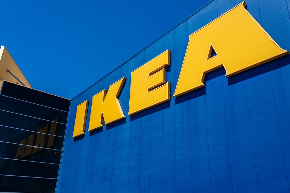
IKEA and the Bright Cheerfulness of Blue and Yellow
IKEA's signature colours—blue and yellow—not only align with the Swedish flag but also tap into colour psychology. Blue evokes trust and dependability, reinforcing the brand's promise of affordable, reliable home furnishings. Yellow adds a burst of cheerfulness and energy, helping to balance the functional feel of the store with a touch of playfulness. The result is a space that feels approachable, efficient, and friendly.
These examples show that when used intentionally, colour can do more than beautify a space—it can anchor a brand's identity, influence customer perception, and even guide purchasing behaviour. In the world of retail, colour isn't just visual—it's emotional, experiential, and deeply strategic.
Colour is an incredibly powerful tool in retail, influencing everything from customer emotions to purchasing decisions. By strategically incorporating colour psychology into your store's design and visual merchandising and display, you can create an engaging, memorable shopping experience that aligns with your brand and appeals to your target audience. Whether you're designing a new retail space or revamping an existing one, understanding the power of colour can give you a significant competitive advantage in the ever-evolving retail landscape.
Write For Spring Fair Retail Insights
We're on the lookout for passionate voices to contribute to our retail blog. Whether you're a figurehead in the industry or simply have a sharp eye for trends, insights, or stories worth sharing, we'd love to hear from you.
This is your chance to inspire, inform and connect with a community that cares about the future of retail just as much as you do.
Do you have an idea? Let's chat. Get in touch with us today.
Featured Articles
- 1 5 Stunning Homeware Suppliers you Need to Know About
- 2 Celebrating Inspiring Women in Retail: Spring and Autumn Fair's Commitment to Championing Women in Retail
- 3 UK Retail Insights 2025: Consumer Caution and Selective Spending
- 4 Theo Paphitis: Small Businesses, Big Impact
- 5 A Fireside chat with Olivia Bowen and Keplin CEO Ray Mehra
)
)
)
)
)
)
)
)